Political polarization in Colorado

There has been a great deal of digital ink spilled over the past few decades about political polarization. Often these pieces take the form of a detached observer wringing their hands over the state of politics in the country and wishing for a return to an (often imaginary) day when politics was characterized by compromise and good-faith debate rather than partisan tribalism. That nostalgia is often misplaced.
This post will focus on quantitative measures of political ideology, but it should not be forgotten that behind these numbers are decades of actual politics affecting the lives of hundreds of millions of people in the U.S. and around the world for better and worse. Quantification is a powerful tool, but the process of assigning numbers to real-world outcomes can have the effect of draining the life from them. Try not to mistake the map for the territory.
Measuring political ideology
In this post, I'll focus on a measures of political ideology developed by political scientists (DW-NOMINATE). This measure is derived from the roll-call voting patterns of legislators. This approach necessarily simplifies a very complicated set of actors, institutions and circumstances, but it has been shown to be useful in understanding elite political behavior.
More about DW-NOMINATE
DW-NOMINATE scores are based on roll call voting records, and the method has been extended back to the first congress in 1789. At a high-level, this method proceeds by estimating the "ideal points" of legislators and the positioning of legislation within an abstract ideological space. After applying some assumptions, researchers can come up with scores for every voting legislator, and (by making a few additional assumptions), they can compare these scores over time (for a very cool visualization of this data, see Randall Munroe's poster-sized graphic here at xkcd).
One way to think about how these scores are arrived at is to use a geographic analogy. Suppose you had a listing of major cities and the pairwise distances between them. Given such a list, and the knowledge that a two-dimensional spatial model is appropriate in this setting, you could apply some statistical techniques to transform those pairwise distances into a map and position the cities within it. The roll-call scaling proceeds in a similar manner. Researchers use the roll-call voting records of legislators to quantify how far apart any two legislators are in their voting behavior and place them into an abstract ideological space.
Polarization as distance
One way that we can use these scores is to look at the average ideological positions of each party over time. The graphic below shows the two trends going back to 1900.
Average ideological placement of the two major parties by chamber (DW-NOMINATE), 1900-2024
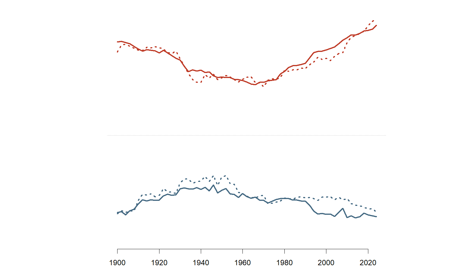
Obviously, reducing 125 years of politics to a single dimension glosses over a great deal, but the plot above still has a lot to say. Politics (at least in the Congress) was characterized by two very distinct parties at the turn of the 20th century. The following decades saw the two parties becoming less distinct from one another. This also corresponds with a period of near complete Democratic dominance in the House of Representatives. With the exception of a handful of years, Democrats held majorities in the House and (to a somewhat lesser degree) Senate from 1931 to 1995. Beginning in the 1950s and accelerating through the next few decades, the parties moved apart once more.
This time of less-distinct parties is where some political scientists argue American was actually a three-party system in practice: Northern Democrats, Southern Democrats and Republicans. In any interpretation, this was a period of transition as the Democrats made significant movements toward supporting civil rights for Black Americans and the Republicans shifted to their "Southern strategy."
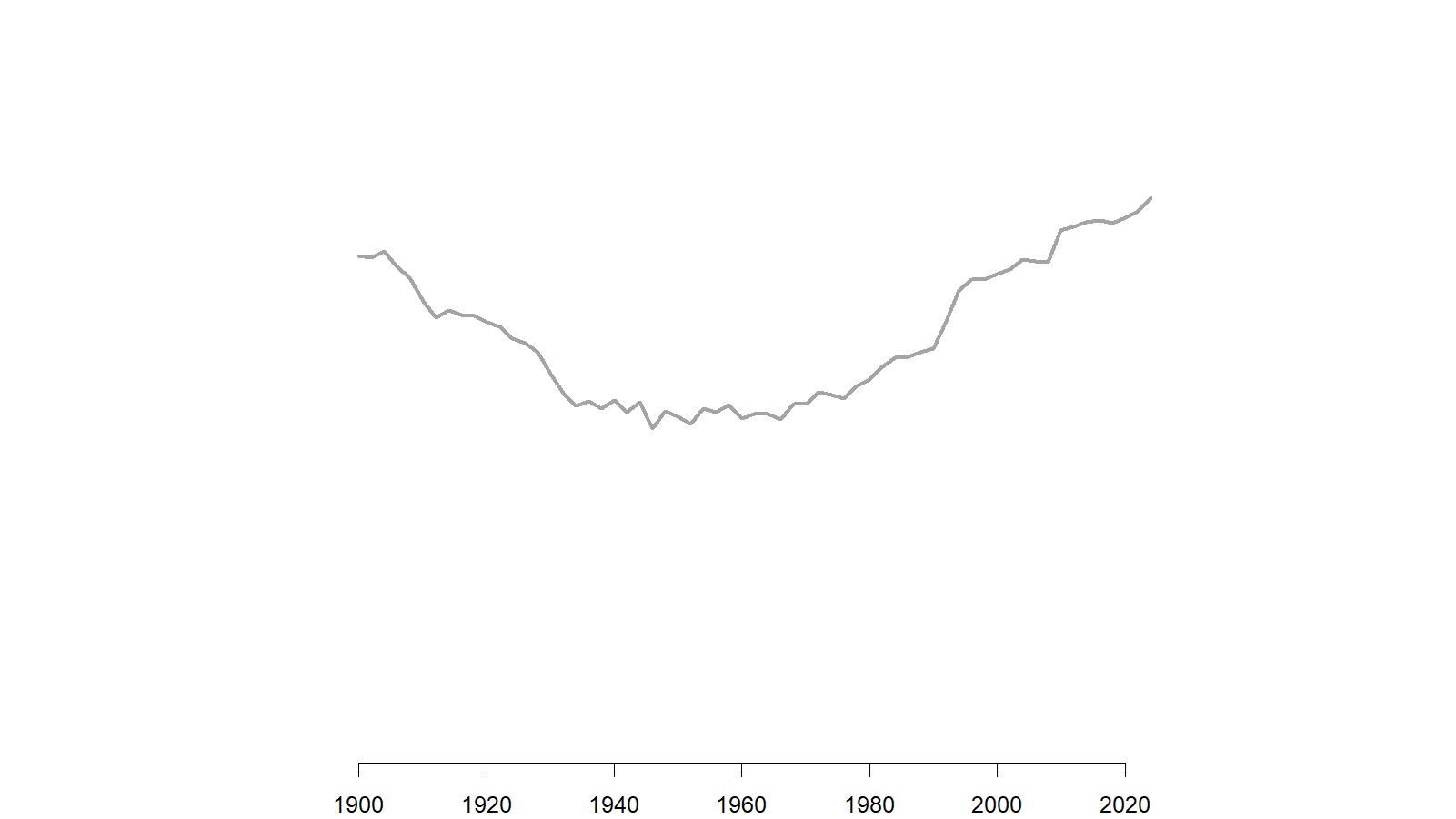
One way to think about polarization is the ideological distance between the two major parties. The graphic below compares the party gaps as estimated by the two data sources in the House of Representatives (the trend for the Senate gives a similar result). Each documents a similar divergence during the period from 1980 to the present.
Difference between the average ideological placements of the two major parties, 1900-2024
While it is important to understand the average distance between the two parties, there are many factors that could be driving the changes seen in the graph above. The country has changed dramatically over the past 125 years, and politics has shifted as well. In the next section, I'll look more closely at the dynamics within Colorado and discuss a different way to measure polarization.
Polarization within Colorado
How does Colorado fit into the national picture?
Colorado's congressional delegation has generally been more conservative than the national average. This is in line with the general Republican tilt of the state from at least 1900 to the mid-2000s. In the early part of the timeseries (the early 1900s to about 1940), Democratic representatives from Colorado were to the right of the average for Democrats in the House. Starting around 1940 and continuing to today, the average position of Colorado Democratic representatives has very closely mirrored the average for all Democrats in Congress.
Average ideological placement of the two major parties by chamber (DW-NOMINATE), Colorado delegation, 1900-2024
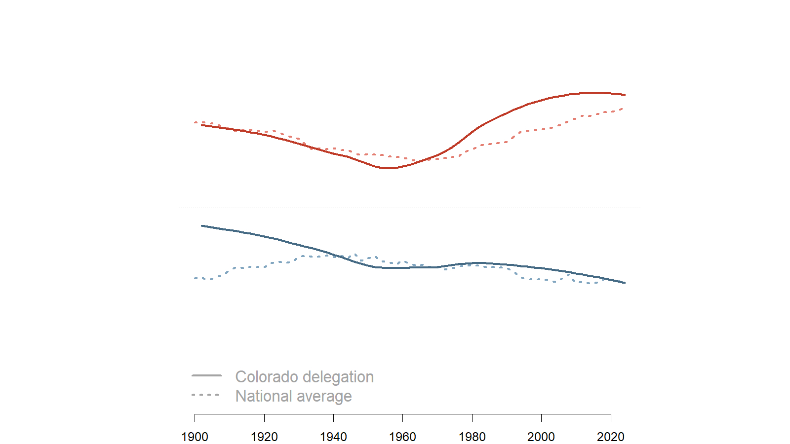
Colorado Republican representatives were very close to the national average for all Republican Representatives from the early 1900s until about 1970. Beginning in the 1970s and continuing through today, Colorado Republican representatives have been significantly more right-leaning as a whole compared to national Republicans.
Another way of interpreting this data is to look at a single slice in time rather than the trend over time. The graphic below shows how the ideology scores relate to district partisanship in the most recent Congress.
Positioning of Colorado's representatives, 119th Congress (2025-2026)
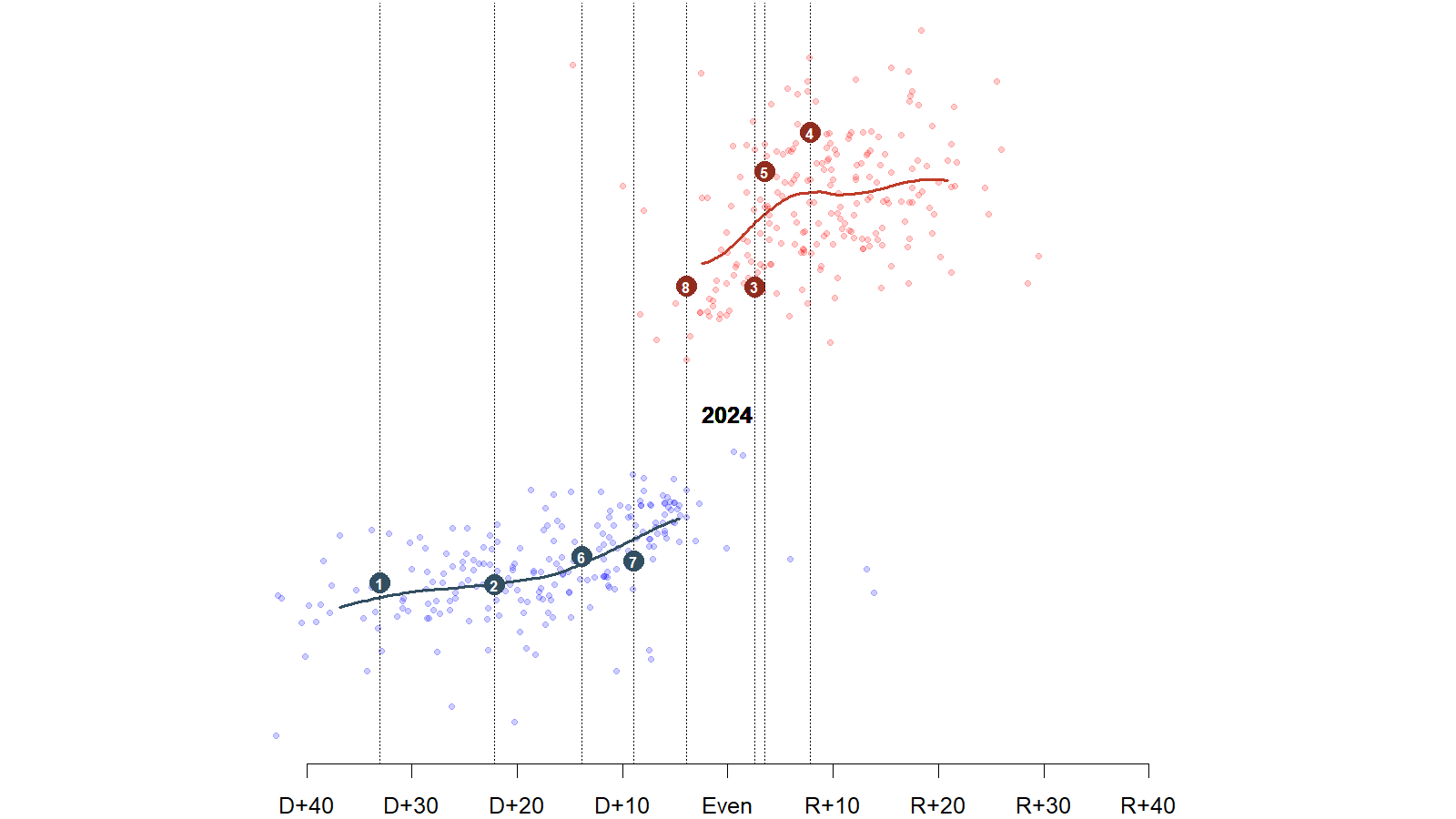
Something like the relationship we might expect is seen between district partisanship and legislator ideology. Districts that vote more reliably for Democrats are represented by politicians who take positions that are further to the left, and vice versa for districts that are more reliably Republican. The highlighted points show the positions of the Colorado representatives. Consistent with the chart that looks at trends over time, Colorado Democrats are very close to the national average for other Democrats in similarly positioned districts while Reps. Boebert and Crank are pulling up the average for Colorado Republicans away from the national average for other Republicans in similarly situated districts.
"Intradistrict divergence" as a measure of polarization
One concept political scientists use to understand polarization is "intradistrict divergence." This is a jargony way of talking about the gap (observed or, more often, expected) between legislators who represent the same constituency. Except for the case of Senators (and some historical multimember districts prior to the passage of the Uniform Congressional District Act in 1967), we don't actually see the same constituency being represented by members from different parties at the same time which is the most straightforward way to see the partisan gap.
Split senate delegations (where the senators from the same state don't share the same party) have declined substantially since their high point in the 1980s and have now reached their lowest point since the direct election of senators with the passage of the 17th amendment in 1917 (now only four states have split delegations).
To simplify the argument greatly, the logic of intradistrict divergence is that two politicians from opposite parties representing the same constituency (Senators in the same state for example) face the same electoral pressures and we might expect them to position themselves similarly politically so as to best retain their seat, so differences in their records can be explained by partisanship.
The graphic below shows the estimated ideological positions of Senators in Colorado going back to 1954. In any given year, these senators were representing the exact same constituency. Generally the senators' estimated ideology falls fairly close to the smoothed averages that are drawn through the middle of each set of points.
Ideological positions of Colorado Senators, 1954-2024
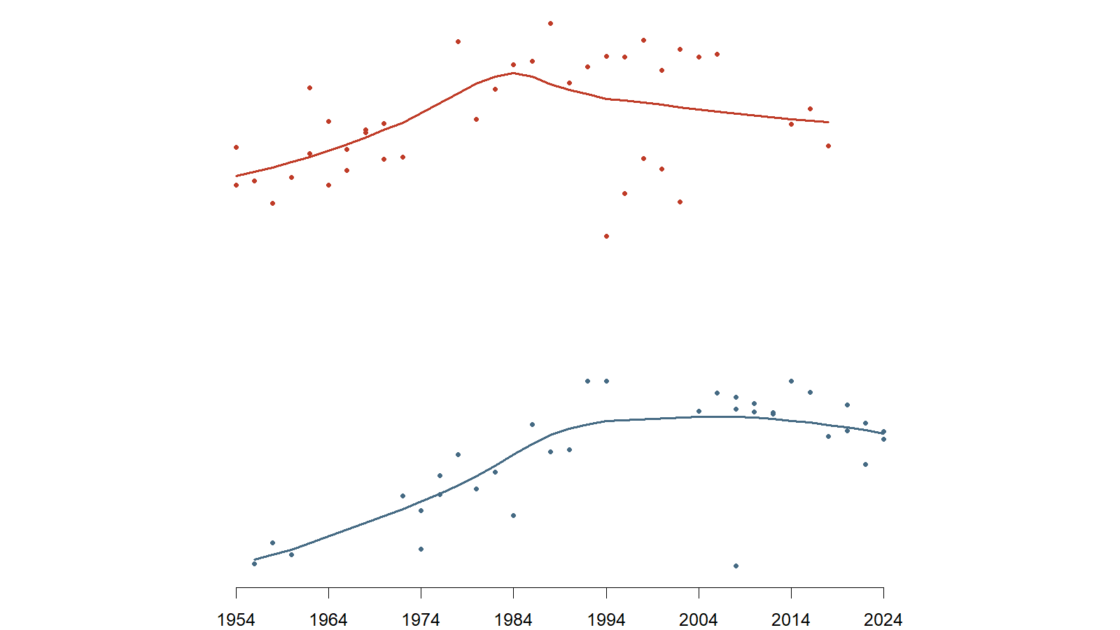
The graphic above shows visually how the intradistrict divergence measure works. Even during times where there is no senator from one party (e.g. 1963-1973 there were no Democratic senators in the Colorado delegation), we can estimate where a hypothetical senator would be expected to fall. The intradistrict divergence measure is the distance between where we would expect a Republican representing that district to be placed and where we would expect a Democrat representing the same constituency to be placed.
The above graphic also underscores the limitation of this model. Take the period of the mid-1990s to the present among Republican Senators in Colorado. At the beginning of this period, the Republican average is pulled down substantially by Sen. Ben Nighthorse Campbell's more idiosyncratic voting patterns, but his colleague and co-partisan at the time, Wayne Allard, had a much more conventionally conservative voting record. After Allard's retirement, the only other Republican to be elected to the Senate in Colorado was Cory Gardner whose narrow win in 2014 was supported by centrist groups like "No Labels." One can imagine a world where Campbell never switched parties or Cory Gardner lost is narrow election which would have produced a much different looking trend.
The graphic below shows how the expected gap between Colorado's senators compares to the differences we see in other states. Colorado shows a much more pronounced difference in the early part of the data. From 1954 through the 1990s, the expected partisan gap between senators representing Colorado from opposite parties is much larger than the national average. The Colorado trend started to decline sharply in the 1980s. Beginning around the mid-2000s, the the national average began increasing steadily. At the same time, the expected difference in Colorado continued to decrease. Today, the expected gap in Colorado is somewhat lower than the expected gap in most other states in the country. The analysis of the House (that leans more on modeling), produces substantively similar results.
Estimated partisan gap between senators representing the same states, 1954-2024
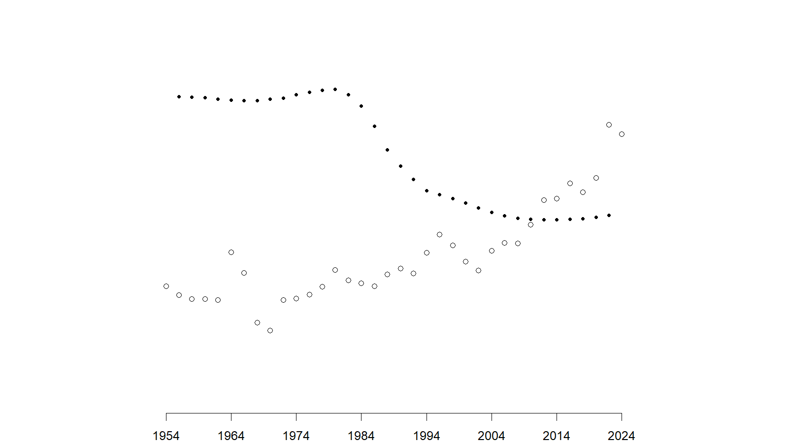
Colorado's trajectory in the graphic above means it has swum against some pretty strong national political currents. Contrary to the national picture of increasing within-state divergence, the estimated ideological gap between senators of opposite parties representing Colorado has fallen dramatically from where it was in the middle of the last century.
There are two primary drivers of this pattern in Colorado: First is the historical contingency already discussed on the Republican side. Had things played out slightly differently, the estimate of the expected Republican position may have looked very different. The second is perhaps surprising moderation of the Democrats who are elected from Colorado. Colorado has moved in a reliably Democratic direction since the mid-2000s, but the placement of Democrats representing the state has not kept up with the political shifts in the state as whole.
Some concluding thoughts
As discussed at the beginning of the post, this very simplified model of political ideology that produced the data for this analysis covers over nearly all of the nuance in politics. As the adage goes, "all models are wrong, but some are useful." We shouldn't let the usefulness of this particular way of viewing politics distract from the many ways in which it is wrong.